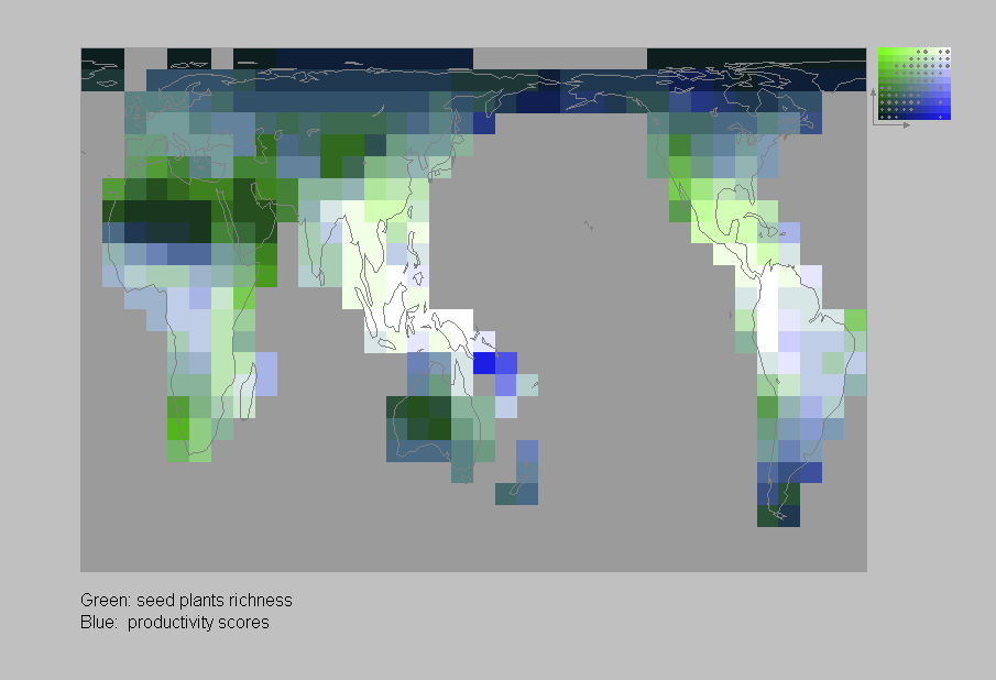
The geographic distribution of deviations from the relationship
between plant family richness and net primary productivity (taken here
from the published values modelled by Uchijima & Seino) can be investigated
by overlaying
estimates for the two in two separate colours. The example uses green for
plant family richness and blue for the productivity scores, so that black
grid cells on the map show low values for both, white shows high values
for both, grey shows similar values for both (these scores lie on the diagonal
of the colour key, to the upper right), green shows an excess of plant
families over productivity, and blue an excess of productivity over plant
families (Spearman correlation coefficient rho= 0.85) (below):


Copyright
(c) 1998 The Natural History Museum. Please read the disclaimer.
