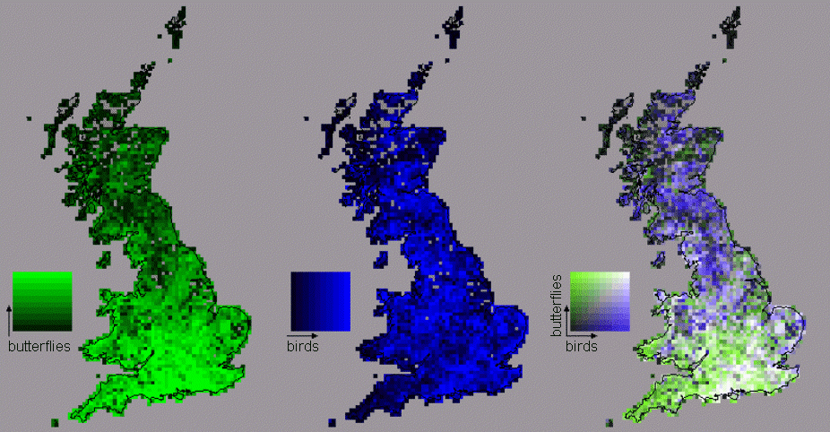
These green and blue maps are then overlaid in the third map. Consequently,
black grid cells on the third map show low richness for both butterflies
and birds; white shows high richness for both; and shades of grey show
intermediate and covarying richness for both (these covarying scores lie
on the diagonal of the colour key, to the left of the third map) (below):

Areas of the third map with highly saturated green
cells show an excess of richness for butterflies over birds, and
areas with highly saturated blue show an excess
of birds over butterflies (Spearman correlation coefficient rho=
0.25). The colour classes are arranged to give even frequency distributions
of richness scores along both axes (at least within the constraints imposed
by tied richness scores).